A DRY approach to overflow menus in Angular using portals
Intro
Let’s pretend you face the following problem:
- You need to develop a horizontal toolbar for a desktop web app
- The toolbar needs to host a ton of components because your app can do a ton of things
- You need to support responsiveness up to the point where the components inside your toolbar don’t fit anymore
- Just hiding elements on small windows is not an option
- Breaking into more vertical space is also not an option
- Horizontal scrolling is not a solution, because you are not a maniac and know it sucks on desktop
To solve this problem, we need an overflow menu that can host less important components when there is not enough space. Looking around the web it seems that this approach is a commonly accepted solution: If you are a heavy user of chrome plugins you know it. If you are a MS Office user you also know it.
So let’s get into building this in angular! If you want to jump ahead and directly look at the full code here is the repo. Also, as it is considered good practice (at least by me), here is what the final thing will look like:
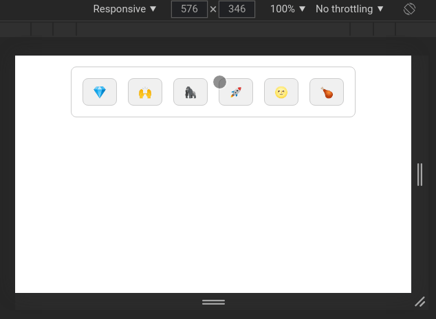
So what is going on here? The components inside our toolbar magically move from the container to the overlay menu when the window reaches a certain width (breakpoint). As soon as one component disappears from the container, the overflow-menu button appears so you can open an overlay menu which now hosts the disappeared component.
Portals and Outlets
To get to the bottom of it, lets first take a look on how cdk overlays and portals work. There are two different types of cdk portals: ComponentPortal and TemplatePortal. Both of them are capable of rendering content dynamically. The ComponentPortal relies on a component for this (who would have guessed that…) while the TemplatePortal makes use of an ng-template as content for the the portal. As we don’t want to rely on a specific component for our overflow-menu because we also just don’t know what components will be used in the toolbar eventually, we will go for a TemplatePortal.
To make the dynamic rendering possible every TemplatePortal needs two things:
- a
TemplateRefthat defines what content will be rendered - a
PortalOutletthat defines where the content should be rendered
To obtain a TemplateRef we just add a ng-template in our component and put an template variable on it to be able to later address it with @ViewChild.
The outlet can be defined in many different ways. The official docs of the cdk portal use the convenient cdkPortalOutlet directive on another ng-template. To seal the deal, the only missing link is to create an instance of your portal and set it as the input of the cdkPortalOutlet directive. Now your template will be rendered inside the element that has the directive.
The setup looks something like this:
1 | <ng-template [cdkPortalOutlet]="portal"></ng-template> |
1 | ('content') templateContent: TemplateRef<any> |
Overlay as portal outlet
Congratulations! We just created a very complicated way to render a template in exactly the same place it would have been rendered if we just removed all the stuff around it (I promise, it will make sense later).
Now its time to look at another, less convenient possibility for defining our outlet: An Overlay. Instead of just passing a portal to a directive, we now have to create an OverlayRef using the Overlay service from cdk.
1 | const positionStrategy = this.overlay |
The notable new players on the field now are an overlay origin and a position strategy. The origin defines what element of the DOM will be taken as a reference for where to place the overlay. The positionStrategy defines how the overlay will appear relative to its origin. I won’t go into too much detail on position strategies because this could be a whole topic for itself.
The final step to make our template appear inside the overlay now is to create a TemplatePortal - just like in the first version - but then attach it to the overlay:
1 | this.portal = new TemplatePortal(this.overlayContent, this.viewContainerRef) |
Now the template will appear in our overlay!
Context-aware rendering
Maybe you noticed already where this is going: To achieve what we want for our overflow menu, we need to combine the two approaches into one. Components in our template should be rendered in a standard outlet when there is still enough space. If there is not enough space they should be rendered in the overlay outlet.
The lazy solution could now be to just create all the items in your toolbar twice - once in the actual toolbar and once in the overlays template - and then just ngIf them in one or the other place based on the window width. That’s not what I went for though because its WET, hard to maintain and bulky to read.
To break down the better, DRY solution, let’s have a look at final API first:
1 | <jcs-dynamic-overflow-menu> |
The component makes use of content projection to define the two major elements:
- The template that contains the dynamic content
- The button element to be use as a trigger of the menu
In addition you see a structural directive *jcsResponsiveItem that seems to have something to do with the responsive behavior of the dynamic items. Structural directives help adding and removing DOM content dynamically. The most well known one is *ngIf which just iffes away elements if the expression returns a falsy value. Our structural directive works similar. We detect wether an item inside the toolbar or inside the overlay and use the breakpoint input to determine if it is supposed to be rendered or not.
1 | ('jcsResponsiveItem') itemType: 'auto' | 'host' | 'overlay' = 'auto' |
The inputs of this directive are the item type and the breakpoint. The item type makes it possible to define if an item should only ever be displayed in either the host or the overlay or actually use the breakpoint to determine it’s location.
If the type is set to 'auto' the breakpoint input is needed to define the number of pixels from where the item should be rendered in the overlay and not in the host. Read it like “Minimum window width for this item to still be rendered in host”.
Next we need to find out if the host element (of the directive) is inside the host component or the overlay using isInHost. The best way I could come up with to determine this is to (recursively) test if nodeName of the parent Element is 'JCS-DYNAMIC-OVERFLOW-MENU'. There might be better ways of doing it but this does the job.
To determine if our item now should actually be rendered in the place it is in we use shouldBeInHost to determine if an item should be rendered in host. The function updates every time the window is resized. You can see the implementation here. Based on that, the last task is now to actually render our item using createEmbeddedView from ViewContainerRef or clear it if necessary. Check the structural directive docs to learn more about how this works.
Content projection
At this point we are basically done with the tricky part. But maybe you wondered how we were able to pass the elements inside of jcs-dynamic-overflow-menu to the portals. Maybe you did not wonder about this, then you can skip this section.
Generally, I don’t like to add a lot of inputs to component like this as it is not so nice to read and understand imho. So what we want to go for in a component like this is content projection! As you can see in the example above, we need to project two main parts of the menu:
- The template that contains our dynamic item components
- The button that lets a user open the overlay
The button is easy: We just create a div, add a click listener and project it inside using the select attribute:
1 | <div |
The template is a bit more tricky as we need it’s reference in the controller to be able to pass it to the portal. Fortunately, there is @ContentChild(), a not so well-known decorator that lets us select a projected element. We basically use this now as replacement to the @ViewChild() from the first step. We can’t use template variables here, so we need to go with just selecting the first occurrence of TemplateRef in the projected content:
1 | (TemplateRef) dynamicContent: TemplateRef<any> |
This is how we make the template available to be thrown into any kind of portal :)
Recap
At this point our menu actually works! To better understand what actually happens let’s recap what we built:
- We created the host component and added content projection to make it possible to supply dynamic content and a trigger button element to our menu.
- We took the dynamic content inside of the host and rendered it both in the host component and also inside an overlay.
- To add the dynamic rendering we added a structural directive to the items inside the dynamic content, that determines if an item should be rendered in the host or in the overlay
What we end up with is a re-usable component that takes care of automatically moving any element that is inside it to the overlay if the breakpoint is reached.
What I really like about this solution is the fact that it is DRY af. Using it does not require you to maintain two sets of the same components. This makes it super readable and easy to use.
Drawbacks
While developing I was mostly bothered by two major drawbacks:
- The way to determine if an item is rendered in host or not is weak. Also I always thought “there must be a more ‘angular’ way of doing this”. If anyone has an idea, please let me know.
- Explicit breakpoints have to be provided. I tried to make it work with estimating the optimal breakpoints automatically based on the with of all items inside the host, but it did not work properly. I think in many scenarios it should be fine that explicit breakpoints are needed. In the end people are used to it from CSS.
If you made it until here, I can only say thank you for reading the whole thing!